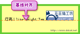
如果行内含有图片和文字,在浏览器内浏览时,读者可以发现文字和图片在垂直方向并不是沿中线居中,而是沿基线对齐,如图7-34所示。
图7-34 文字和图片内容默认垂直对齐方式为基线对齐 这是因为,元素默认的垂直对齐方式为基线对齐(vertical-align: baseline)。 7.4.1 语法 vertical-align属性的具体定义列表如下: 语法: vertical-align : baseline | sub | super | top | text- top | middle | bottom | text-bottom | <百分比> | <长度> | inherit 说明: 设置元素内容的垂直对齐方式 值: baseline:基线对齐;sub:下标;super:上标;top:顶端对齐;text-top:与文本的顶端对齐;middle:中部对齐;bottom:底端对齐;text-bottom:文本的底端对齐; 百分比和长度:CSS2,可为负数。 初始值: baseline 继承性: 不继承 适用于: 行内元素和单元格(table-cell)元素 媒体: 视觉 计算值: 百分比和长度值为绝对长度;其他同指定值 此处需要特别注意的是:垂直对齐属性只对行内元素有效。例如有如下代码:
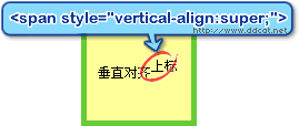
<p style=”vertical-align:super;”>垂直对齐<span>上标</span></p>
<p>元素默认为块级元素,因此在浏览器内浏览时将不会有任何变化。而如下代码:
<p>垂直对齐<span style="vertical-align:super;">上标</span></p>
<span>元素默认为行内元素,因此显示如图7-35所示。
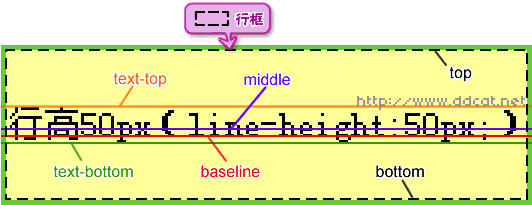
图7-35垂直对齐属性只对行内元素有效 行内元素还包括图片、表单输入元素等,同时,垂直对齐不能被继承。 7.4.2 属性值详解 在[7.3 行高 line-height]一节中,曾经介绍了文本的基线、顶线、中线和底线,还有内容区域、行内框和行框,而本节的垂直对齐和这几个概念密切相关。 垂直对齐主要属性值的表现形式如图7-36所示。
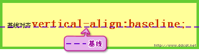
图7-36 垂直对齐的主要属性值示意 1. 基线对齐(vertical-align : baseline) 基线对齐(vertical-align : baseline)使元素的基线同父元素的基线对齐,例如有如下代码:
p strong {
line-height : 7em;
font-size : 2em;
vertical-align : baseline;
}
<p>基线对齐<strong>vertical-align:baseline;</strong></p>
则其显示如图7-37所示。
图7-37 基线对齐 而像图片或者输入框这样的元素,本身没有基线,则将其底端同父元素的基线对齐,如图7-34所示。 2. 顶端对齐(vertical-align : top) 顶端对齐(vertical-align : top)是将元素的行内框的顶端与行框的顶端对齐,例如有如下代码:
p {
line-height : 7em;
}
p strong {
vertical-align:top;
line-height:2em;
}
p img {
vertical-align : top;
}
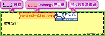
<p>顶端对齐:<strong>vertical- align:top;</strong><img src="img/ddcat_anim.gif" alt="图 片" width="88" height="31" /></p>
则其显示如图7-38所示。
图7-38 顶端对齐 对于<strong>元素,不仅设定了vertical-align,还设定了line-height,这是因为在本章 [7.3.2 内容区域、行内框和行框]一节中关于行内框的说明中介绍过,行高可以改变行内框的高度,如果不重新设定行高, 则<strong>元素继承了父元素<p>的行高,因此行内框高和行框的高度是一样的,则顶端对齐将看不出效果。 3. 文本顶端对齐(vertical-align : text-top) 文本顶端对齐(vertical-align : text-top)是将元素行内框的顶端同文本行的顶线对齐,例如有如下代码,其显示如图7-39所示。
p {
line-height : 7em;
}
p strong {
vertical-align : text-top;
line-height : 2em;
}
p img {
vertical-align : text-top;
}
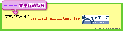
<p>文本顶端对齐:<strong> vertical- align:top;</strong><img src="img/ddcat_anim.gif" alt="图 片" width="88" height="31" /></p>
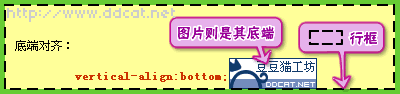
图7-39 文本顶端对齐 4. 底端对齐(vertical-align : bottom) 底端对齐(vertical-align : bottom)与顶端对齐(vertical-align : top)相反,如图7-40所示。
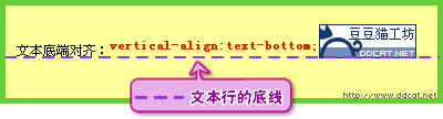
图7-40 底端对齐 5. 文本底端对齐(vertical-align : text-bottom) 文本底端对齐(vertical-align : text-bottom)与文本顶端对齐(vertical-align : text-top)相反,如图7-41所示。
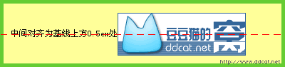
图7-41 文本底端对齐 6. 中间对齐(vertical-align : middle) 中间对齐(vertical-align : middle)通常使用在图片上,将图片的垂直方向的中线与文本行的中线对齐,例如有XHTML代码如下,其显示如图7-42所示。
p img { vertical-align : middle; }
<p>中间对齐为基线上方0.5ex处<img src="img/ddcat_ad.gif" alt="图片" width="180" height="60" /></p>
图7-42 中间对齐 中线的定义为:中线位于基线的上方,与基线的距离为小写字母x高度(即ex)的一半,如图7-36所示。而ex同字体尺寸相关,大部分浏览器认为1ex = 0.5em,因此会将基线以上四分之一em处作为中线来对齐。
注意:同在行高显示上的差别一样,在中间对齐上,各浏览器之间也稍有些差异。
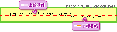
7. 上标和下标 上标(vertical-align:super)使元素的基线(替换元素的底端)相对于父元素的基线升高,下标(vertical-align:sub)使元素的基线降低,移动的幅度CSS规范中没有规定,由浏览器来决定。例如有如下代码,其显示如图7-43所示。
<p>上标文字<span style="vertical- align:super;">vertical-align:super;</span>下标文 字<span style="vertical-align:sub;">vertical-align:sub;</span></p>
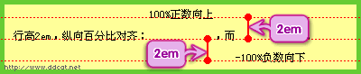
图7-43 上标和下标 上下标不会改变元素文字的尺寸大小。 8. 长度值和百分比 和上下标类似,长度值和百分比值可使元素的基线(替换元素的底端)相对于父元素的基线升高(正值)或者降低(负值)。 上下标的移动尺寸是由浏览器确定的,而设定长度值或者百分比,可以精确控制文字上下移动的幅度。 百分比与行高有关,例如有如下代码,其显示如图7-44所示。
p { line-height : 2em; }
<p>行高2em,纵向百分比对齐:<span style="vertical-align:100%;">100% 正数向上</span>,而<span style="vertical-align:-100%;">-100%负数向下& lt;/span>。</p>
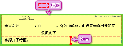
图7-44 百分比对齐 设置垂直对齐会影响到行框高,例如有如下代码,其显示如图7-45所示。
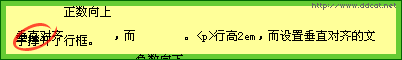
p { line-height : 2em; }
<p>垂直对齐<span style="vertical-align:2em;">正数向上</span& gt;,而<span style="vertical-align:-2em;">负数向下</span>。< p>行高2em,而设置垂直对齐的文字撑开了行框。</p>
图7-45 垂直对齐对行框的影响
注意:在IE中设定百分比或者数值对齐会造成内容的叠加混乱,如图7-46所示。
